Vanguard Clinical engaged me to develop a high-impact digital pitch deck designed to position the company as a trusted partner for pharmaceutical trial sponsors. To ensure clarity and alignment, I first conducted a deep dive into their existing website and collateral—distilling core messaging, tone, brand pillars, and values that had not yet been formally defined.
From there, I led the design and content strategy to clearly showcase Vanguard’s leadership, specialized expertise, core services, and deep industry knowledge in the rare disease space.
The final deck delivered a polished, professional narrative that communicated credibility and confidence—helping the company attract new pharma partners, secure client engagements, and strengthen investor interest. It now serves as a foundational business development tool in Vanguard’s outreach efforts.
As brand and design lead for Live Local Apparel, I partnered closely with the founder to evolve and expand the brand across retail markets nationwide. I oversaw the full creative direction—including brand identity, apparel collections, web design, and marketing collateral—introducing a refreshed, cohesive visual system that helped drive a measurable boost in both exposure and sales.
I personally researched and hand-illustrated over 60 unique, location-specific apparel designs that honored the founder’s original aesthetic while capturing the spirit of each place. Notable highlights include a limited-edition Cal Poly collage—screenprinted live during a university rebrand event—and exclusive campus lifestyle designs now featured in the Cal Poly Bookstore.
My personal brand identity centers around a custom-designed winged "L" icon, representing both my last name and my freelance practice, LaForce Design. The goal was to craft a mark that is modern, minimal, and instantly recognizable—one that reflects my professional presence and design philosophy.
The winged “L” carries layered symbolism, evoking ideas of momentum, elevation, and forward movement—qualities I strive to bring to every client relationship and creative engagement. Paired with the timeless strength of the Gotham typeface, the brand balances precision with approachability.
The color palette of off-black and copper was carefully selected to create a refined, contemporary feel. The warmth of copper adds a subtle sophistication and energy, while grounding the brand in confidence and clarity. Every element was designed to communicate trust, creativity, and purposeful design—core values that define LaForce Design.
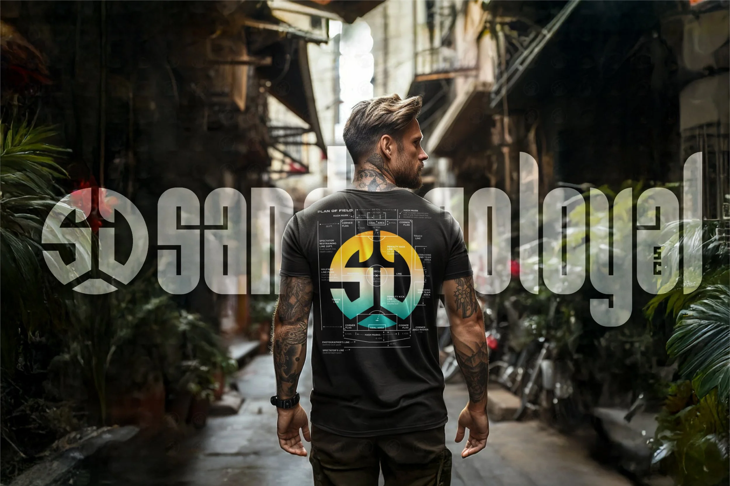
I was commissioned by San Diego’s professional Division II soccer team, SD Loyal FC, to design exclusive team-branded apparel aimed at deepening community connection, strengthening brand identity, and driving merchandise sales.
One of the standout designs, "Play the Field," quickly gained popularity—becoming a top-selling item and repeatedly selling out in the team’s online store. The design not only resonated with loyal fans but also helped attract new supporters, increasing visibility for the club across the region.
The success of the apparel campaign contributed to a measurable boost in local fan engagement, team recognition, and game day attendance—proving the power of bold, meaningful design in energizing a brand and its community.
I led the end-to-end redesign of the Vanguard Clinical website, directing strategy, UX, design, and content to create a cohesive and user-focused digital experience. My responsibilities included overseeing research, wireframing, photography direction, image editing, copywriting, and the design of key site elements to align with the company’s mission and brand.
The result was a streamlined, modern website that significantly improved user engagement, strengthened brand credibility, and supported both client acquisition and talent recruitment—positioning Vanguard Clinical for meaningful growth in a competitive industry.
I partnered directly with retired surfer and legendary board-shaper Ted Rich to modernize and breathe new life into Last Wave Originals—a collection of authentic, heritage-driven surf brands including Canyon, Dewey Weber, Challenger, Roger Hinds, Sex Wax, Lightning Bolt, Linden, Morey Pope, Jerry Grantham, Greg Noll, and Save the Saves.
My role focused on evolving the visual identity of these iconic brands through fresh, marketable apparel graphics and merchandise design that honored their roots while appealing to a new generation of surf culture enthusiasts. This included the creation of original, globally inspired design collections such as the “Surf Spot” icon series, which featured stylized depictions of world-famous breaks, incorporating local flora, terrain, wave types, and cultural references.
My work helped reestablish brand relevance, increase global appeal, and drive merchandise sales—resulting in designs that are now printed and sold worldwide across Last Wave’s apparel lines.
I developed a comprehensive brand manual for Vanguard Clinical, designed to establish a cohesive and strategic foundation for the company’s visual and verbal identity. This guide plays a critical role in ensuring consistency across all touchpoints—enhancing brand recognition, internal alignment, and professional credibility.
To build a clear and authentic brand framework, I conducted an in-depth analysis of existing materials and messaging, synthesizing and formalizing the company’s voice, tone, mission, and value pillars—many of which had not yet been explicitly defined. I also established clear standards for logo usage, brand colors, typography, and design elements to guide all future marketing, digital, and internal communications.
The resulting brand guidelines now serve as a foundational tool for Vanguard Clinical, empowering teams and partners to represent the brand with clarity, consistency, and confidence.
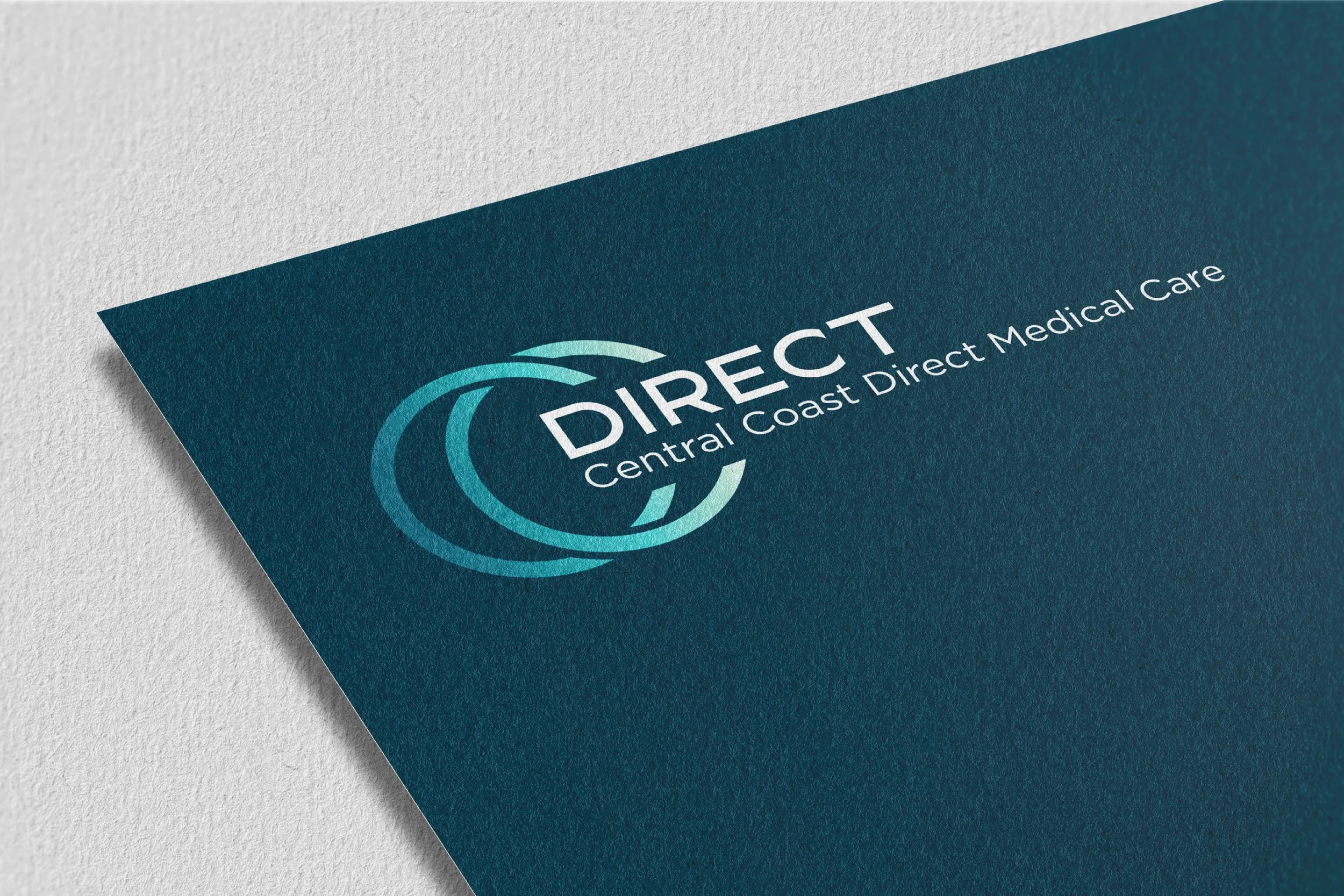
I partnered with Central Coast Direct Medical Care, a concierge home health service, to build and launch their brand from the ground up. This included developing a cohesive visual identity and a full suite of branded collateral to establish credibility, build community awareness, and drive patient acquisition.
From business stationery and informational flyers to targeted door hangers, mailers, and digital ads, I created marketing materials that communicated professionalism, accessibility, and trust—key values for their target audience. The launch campaign helped the brand quickly gain traction in the local community and contributed directly to a strong influx of new patients in the early stages of the business.
I designed a quarterly global newsletter for ImmunoGen, a leading pharmaceutical company, with the mission of clearly and effectively communicating essential drug trial updates to physicians and clinical sites worldwide. This communication tool played a vital role in supporting the success of the study by ensuring that all sites remained informed, engaged, and aligned.
The newsletter delivered key information such as protocol amendments, dosing updates, enrollment metrics, site activations/closures, and study progress—along with educational articles and participant recognition. Every element was designed for clarity and impact, helping busy physicians and staff quickly absorb critical updates.
By providing consistent, visually organized communications, the newsletter helped unify trial execution across global locations, reduced errors or miscommunication, and reinforced momentum and engagement throughout the clinical community.
Contracted by NFL talent management agency Milk & Honey, Inc., I was tasked with developing a personal apparel brand for Denver Broncos wide receiver Courtland Sutton. The goal was to create a distinct identity that stood apart from NFL licensing—intentionally avoiding team colors, logos, or jersey references—while authentically reflecting Sutton’s personal values, particularly his faith and passion for football.
I conceptualized and designed original apparel pieces intended for direct-to-consumer sales through Sutton’s social media platforms, with the brand structured to evolve into a cohesive line that would complement and expand upon a few pre-existing designs. The result was a bold, meaningful brand presence designed to resonate with his fanbase while building long-term equity beyond the field.
Save The Waves Coalition is a non-profit that works to preserve surf spots and the surrounding coastal marine ecosystem.
I designed original graphics for t-shirts that are sold all over California and the U.S. to raise funds and awareness for their conservation efforts.
National Motor Fest is a San Luis Obispo County-founded, international car show based on the local interest in, and abundance of classic, muscle, and supercars in the area. I had the pleasure of working closely with the creators (Tyler Henry, Brandon Stier, Sam Stern) and marketing team to create not only the official brand-mark for the event but posters, fliers, business cards, and other printable and online marketing collateral.
David Nuuhiwa is the legacy brand of surf icon and cultural pioneer David Nuuhiwa—celebrated for his smooth, stylish approach that helped define a generation of surfing. Though rich in history, the brand had suffered from years of neglect until recently being revived by his family and longtime friend Ted Rich, with whom I partnered to reimagine and modernize the brand’s visual direction.
I led the creative redesign of the core apparel line, updating nearly every piece with vibrant, surf-inspired Pantones, cohesive linework, and refined graphic styling. I also advised on garment selection to ensure the blend, fit, and print quality matched the brand’s elevated legacy.
The result has been a powerful resurgence: the revitalized designs have become consistent bestsellers, with multiple pieces selling out repeatedly—helping reestablish David Nuuhiwa as a one-of-a-kind, heritage surf brand now resonating with a new generation of surfers and collectors.
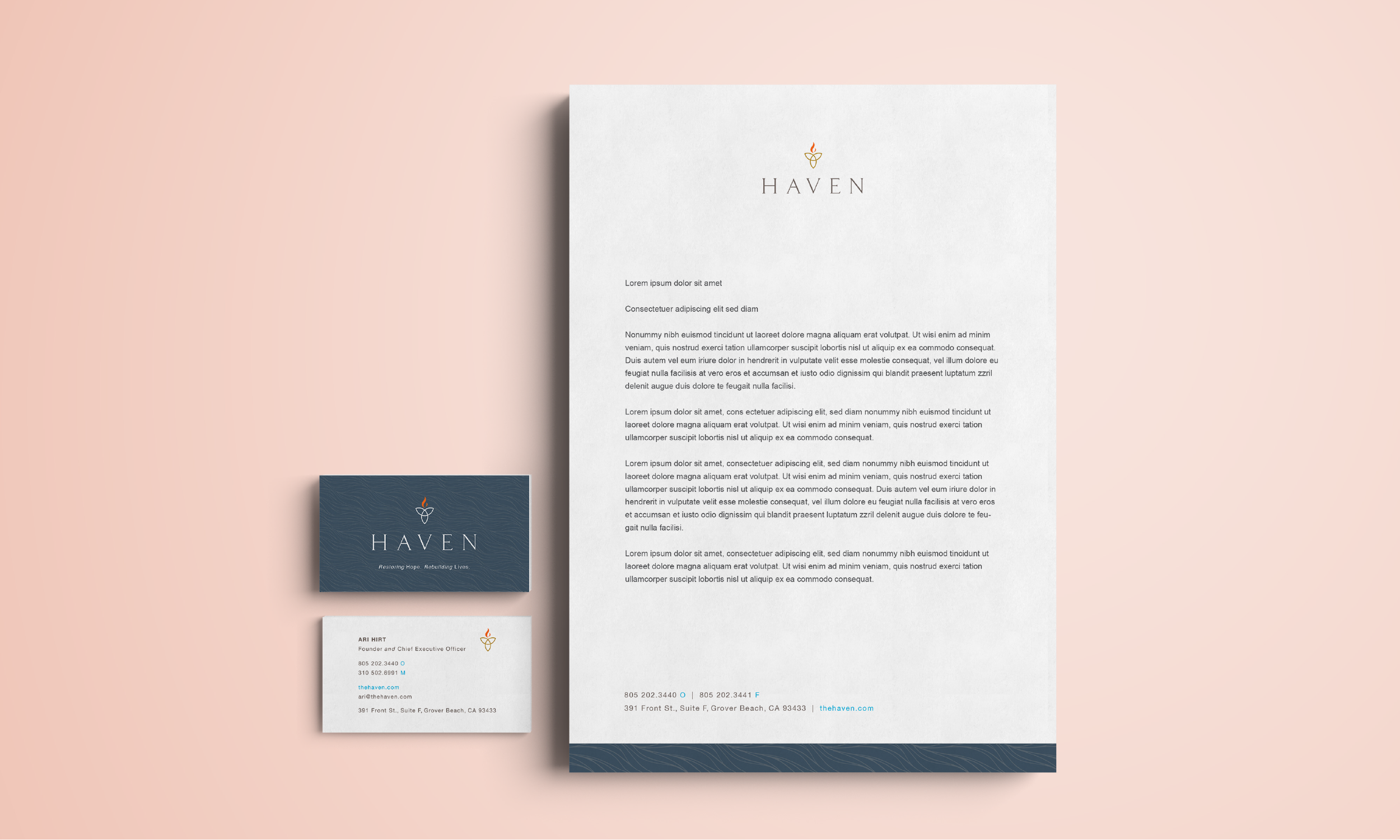
I was hired by a prominent brand-consulting agency to undertake a comprehensive rebrand of The Haven, a local addiction rehabilitation facility in Pismo Beach, CA.. The Haven desperately needed to improve their recognizability and image in order to continue their work on our coast. The project was to focus on the positive and uplifting care the facility provides relying heavily on color palette.
The project encompassed logo ideation and design, business stationery sets, signage, and uniform and badge design. The three-pointed trillium flower and wave imagery can be seen in patterning and logo application throughout the designs representing themes held close to the facility’s pillars of recovery.
As a San Luis Obispo County resident for the past five years, I’ve amassed an incredible body of loyal clients and followers through my freelance work. My clients are mostly local, but extend across the United States from California to Canada.
My logobook features only a small fraction of my favorite works crafted for over 50 clients through the past years.